I recently decided to enter my school’s World No Tobacco Day Poster Competition.
There were two different competitions. One was a Poster Competition and the other was a Tobacco and Vaping Prevention Slogan and Graphic Design Contest.
The rules of the Slogan and Graphic Design Contest were to create a graphic design that includes a slogan. The messaging must be positive and cannot include images of tobacco products or e-cigarettes.
The first thing I did was come up with a slogan. The reason I did the slogan first is because I had no idea what I would do for the graphic and I knew that the graphic would have to revolve around the slogan.
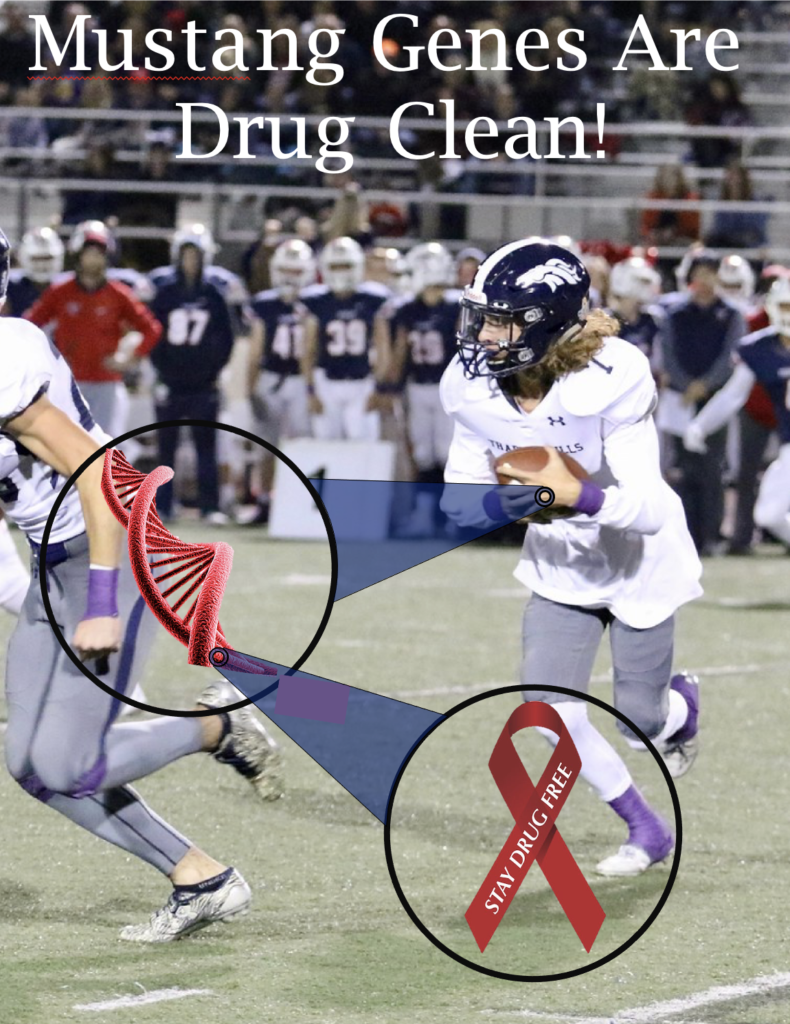
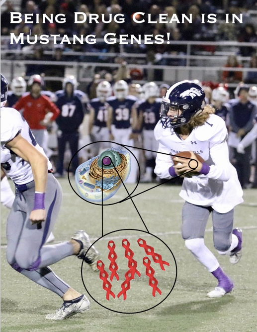
I knew I wanted to use something like “drug clean” in the slogan, so I looked for words that rhyme with clean and I found gene. I then came up with the slogan “Being Drug Clean is in Mustang Genes.” (Mustangs are my school’s mascot) After thinking about it for some time, I realized that the slogan needed to be simplified to be catchier and to just sound better in general. I simplified it down to “Mustang Genes are drug clean.”
The winner would be decided by a student and staff vote and I felt like the gene aspect of the slogan and graphic would win the votes of the science teachers.
For the graphic, I came up with the idea of getting a football player from our school, zooming in on his hand, and showing that his DNA is made of red ribbons.

This is what I came up on the last day of submission. I came up with the idea for the poster and slogan about a week before this date. However, I kept coming up with “rough drafts” and different ideas like this.

While these rough drafts did help the overall product as I did get constructive criticism from others, I should have gone for a final draft with a few days before the due date so I could get constructive criticism on all aspects rather than just the vital components. For example, it is possible that the shapes I used to “zoom in” could have looked better. Additionally, I ended up completing my final draft on the last day of submission. This left no time to catch mistakes I might have made or add other improvements to the final draft.
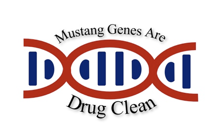
However, in the end, I decided to simplify the graphic even more. I realized that they wanted to use it for merchandise. I thought that a simple design about the size of a logo would look better. This is what I came up with. (I started this at about 9 P.M. and the submission was due before midnight.)

Unfortunately, I did not win the competition. However, I am proud of my work and I think that the end result is actually pretty good.
The main lesson I learned from this experience is to go all out and create a final draft early so you can add onto the final product. This would probably work better than my approach of figuring out the main things that needed to be included in the final draft as I would have also received feedback on the things that are less important and that I only fully created on the final draft. (Like the shapes that zoomed in to various objects.) Additionally, I may have decided to simplify my idea earlier and I would have had more time to work on what I actually ended up submitting.


